Fortepan
- Year of release — 2020
- My roles in the project — UI & UX design, web development
- Tools for development — 11ty, StimulusJS, NodeJS, Webpack, GitHub
Fortepan is a Hungarian historical photo archive, which was established in 2004, it's a non-profit organization that aims to collect, preserve and make available to the public Hungarian amateur and professional photographs from the period of 1900 to the present.
The archive has a diverse collection of photographs including daily life, landscapes, portraits, architecture, historical events and they frequently organize exhibitions to showcase their collections.
My role
I was incredibly lucky to be given the opportunity to revamp the website from the ground up. The founders gave me full trust and autonomy to redesign the whole website and create the frontend architecture from scratch. I selected the following technologies to create a stable front-end environment: Netlify for hosting and staging, 11ty as a static site generator, StimulusJS as a lightweight JS component framework, and Forestry.io for content management. You can check the current state of development on GitHub.
Key learnings and challenges
Participating in a pro-bono project is an excellent opportunity to experiment with new technologies before applying them in your full-time job. I deliberately chose 11ty as my static site generator from among the many alternatives available, as it has a similar directory structure and template language to Jekyll, which was the SSG used at Sketch at the time.
One of the biggest obstacles I faced during this project was managing my time effectively, as I had to balance it with my full-time job, my duties as a husband, and my role as a father of two kids. Additionally, as I previously mentioned, I wanted to experiment with new technologies and explore uncharted territories in terms of modern static site generation development. These circumstances often resulted in development time being underestimated, which then caused frustration between me and the other team members.
Early concepts
I typically begin a project by quickly sketching some initial ideas to ensure that my clients and I have a shared understanding of the visual elements and that our goals are in alignment. The final outcome may differ from these early sketches, but they serve as a useful starting point for discussions and help guide the direction of the project. It also allows us to start thinking more deeply about the final layout, organization, and user experience, and can help identify and address any potential challenges early on.
Web typography and icons
I began by gathering all of the design elements into a Sketch library and constructed reusable components and CSS classes in strict adherence to the design guidelines. The website’s typography has been updated and now uses the Adobe Typekit’s Futura typeface appearing in the branding. New icons have been created for the user interface in SVG format, which adjust in line weight according to the screen resolution.
The redesigned website
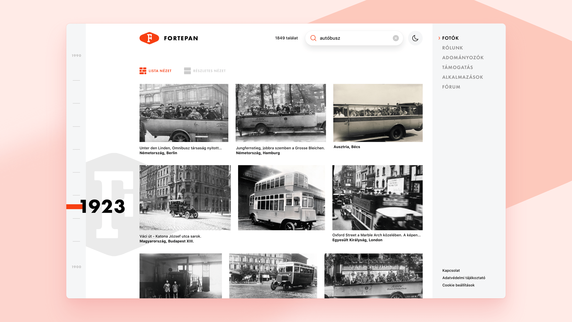
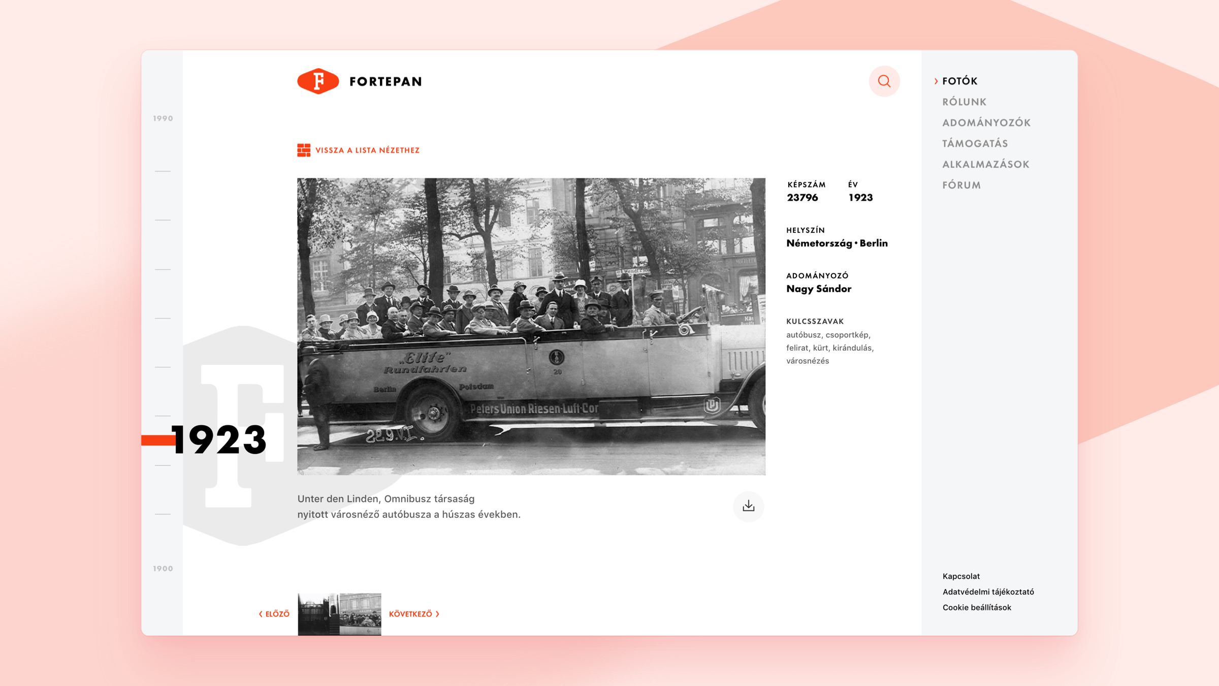
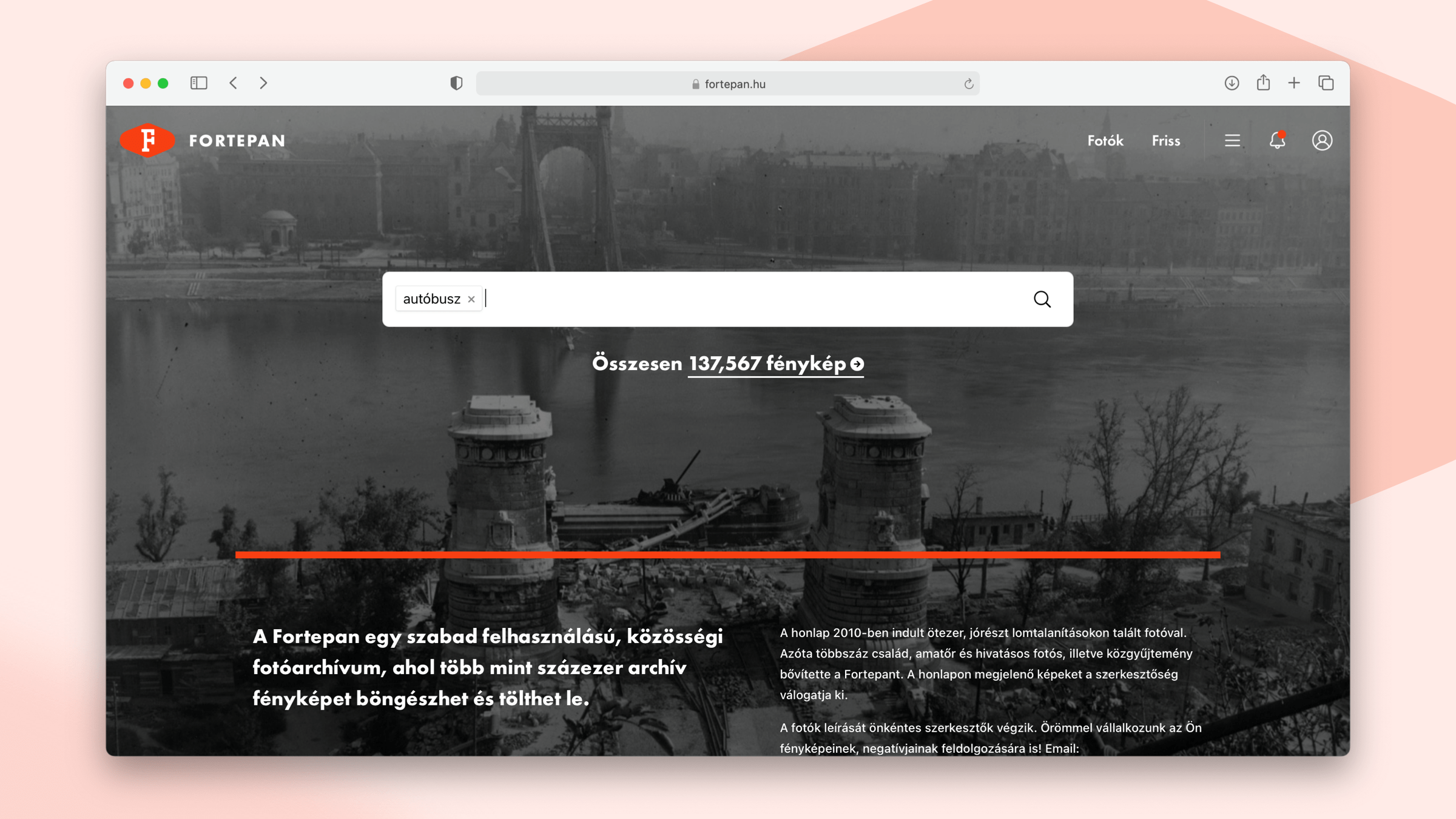
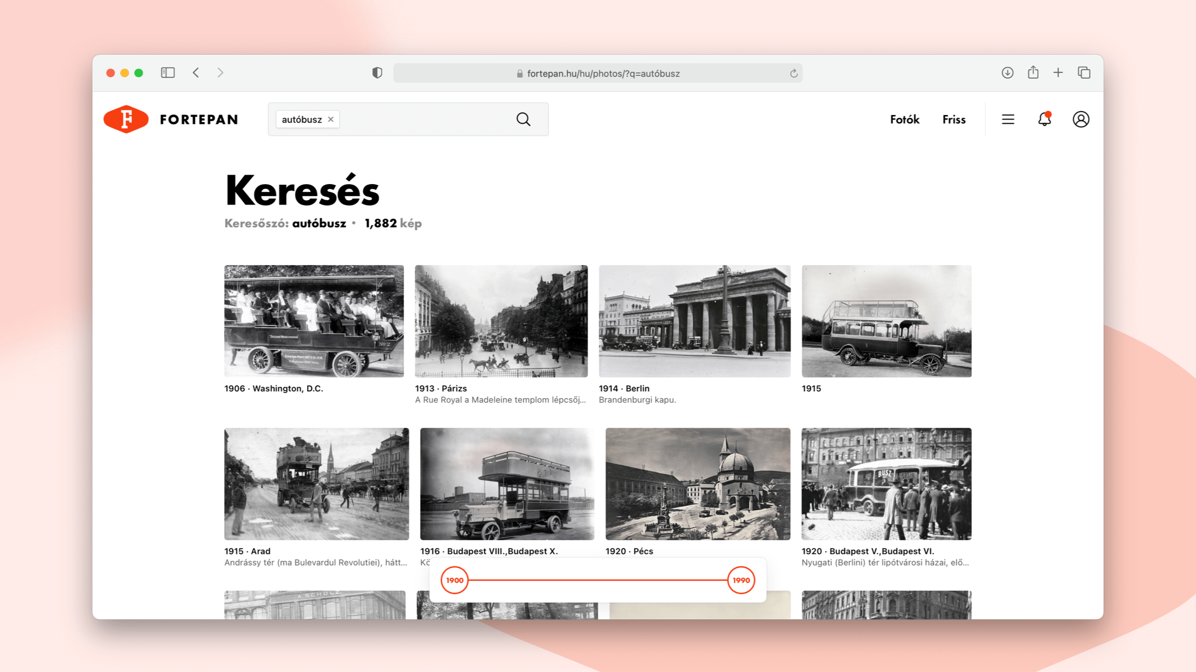
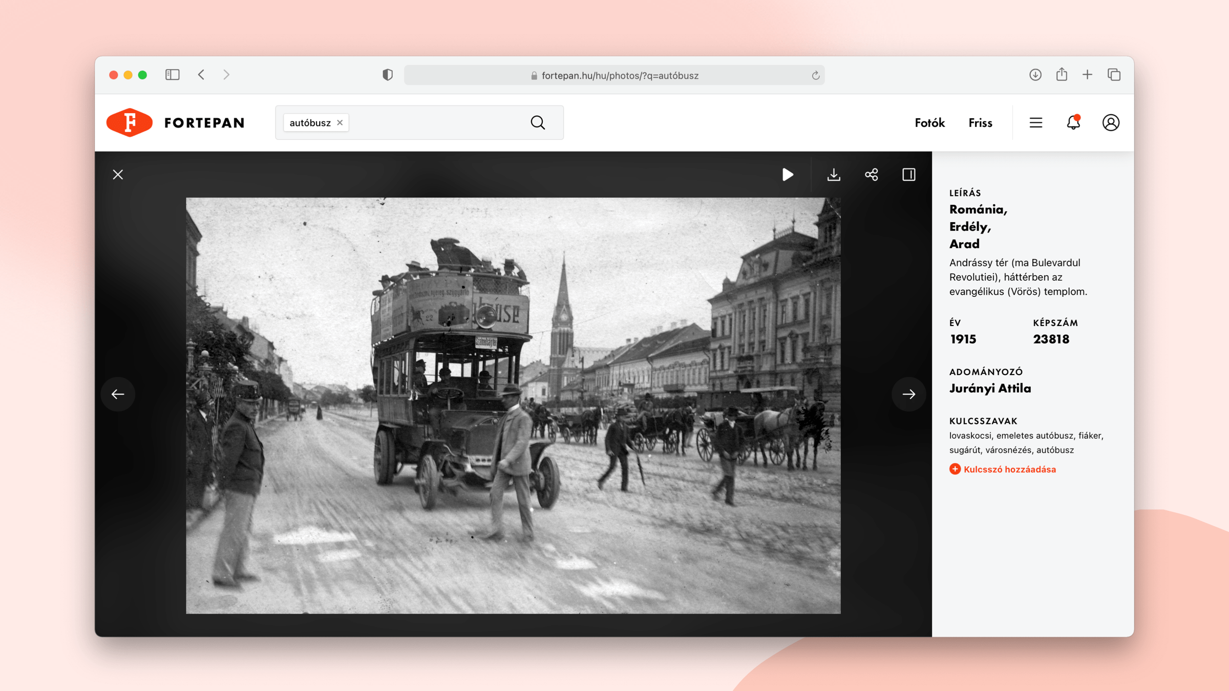
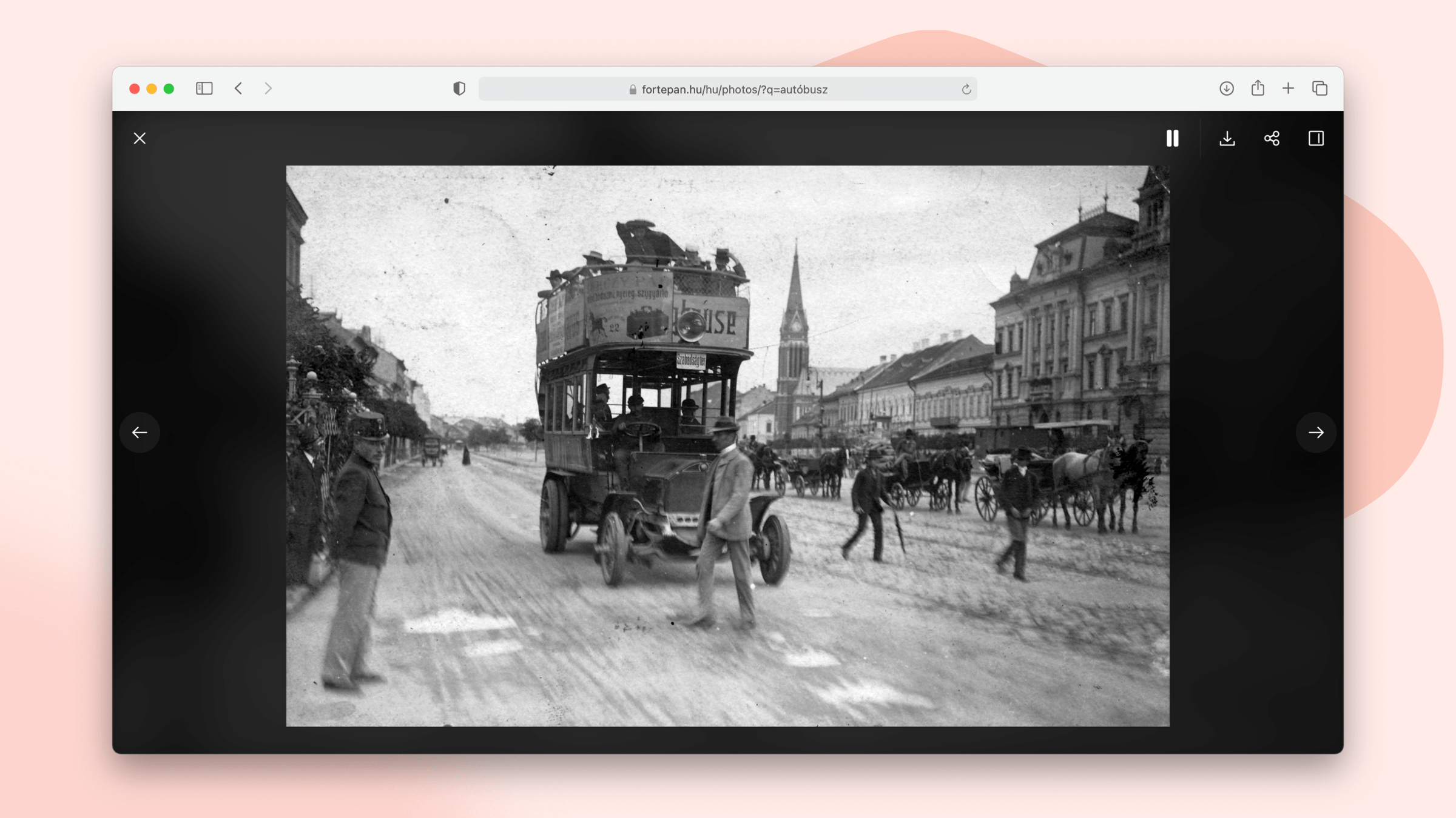
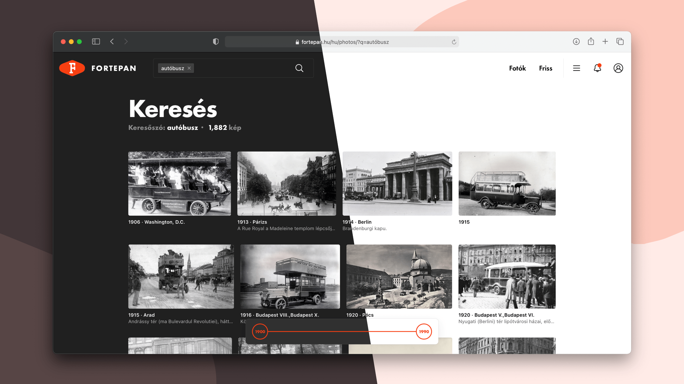
On the homepage, I made the decision to highlight the search function by prominently featuring a large search field above the fold, where users can enter search terms and keywords utilizing Elasticsearch. The browsing interface has undergone a complete revamp and has been relocated to a dedicated new page, which enables users to refine the search results by year via a floating timeline. In the detailed view of the browsing interface, all the data associated with a photo can be easily reviewed at a glance. A slideshow can also be initiated from the search results in the detailed view. Additionally, the archive photos can be viewed in both light and dark modes, allowing users to adjust the interface to their preference and providing better visibility for the photos in different lighting conditions.
