Squareline represents a cutting-edge UI editor that empowers both individuals and professionals to craft stunning user interfaces for embedded devices with speed and simplicity. Currently, they are in the process of recruiting a product designer and seeking a fresh college graduate who can contribute to the design and development of the editor's user interface, while also providing support to clients in implementing their UI designs using the editor.
The task was to design two screens with a resolution of 1280x720, each serving as user interfaces for a smart home controller. Although I was provided with some initial parameters, I had the freedom to explore and create a design as I saw fit. Moreover, if my designs were used in any way, I would be compensated for my work.
Home 1 - Dark Theme
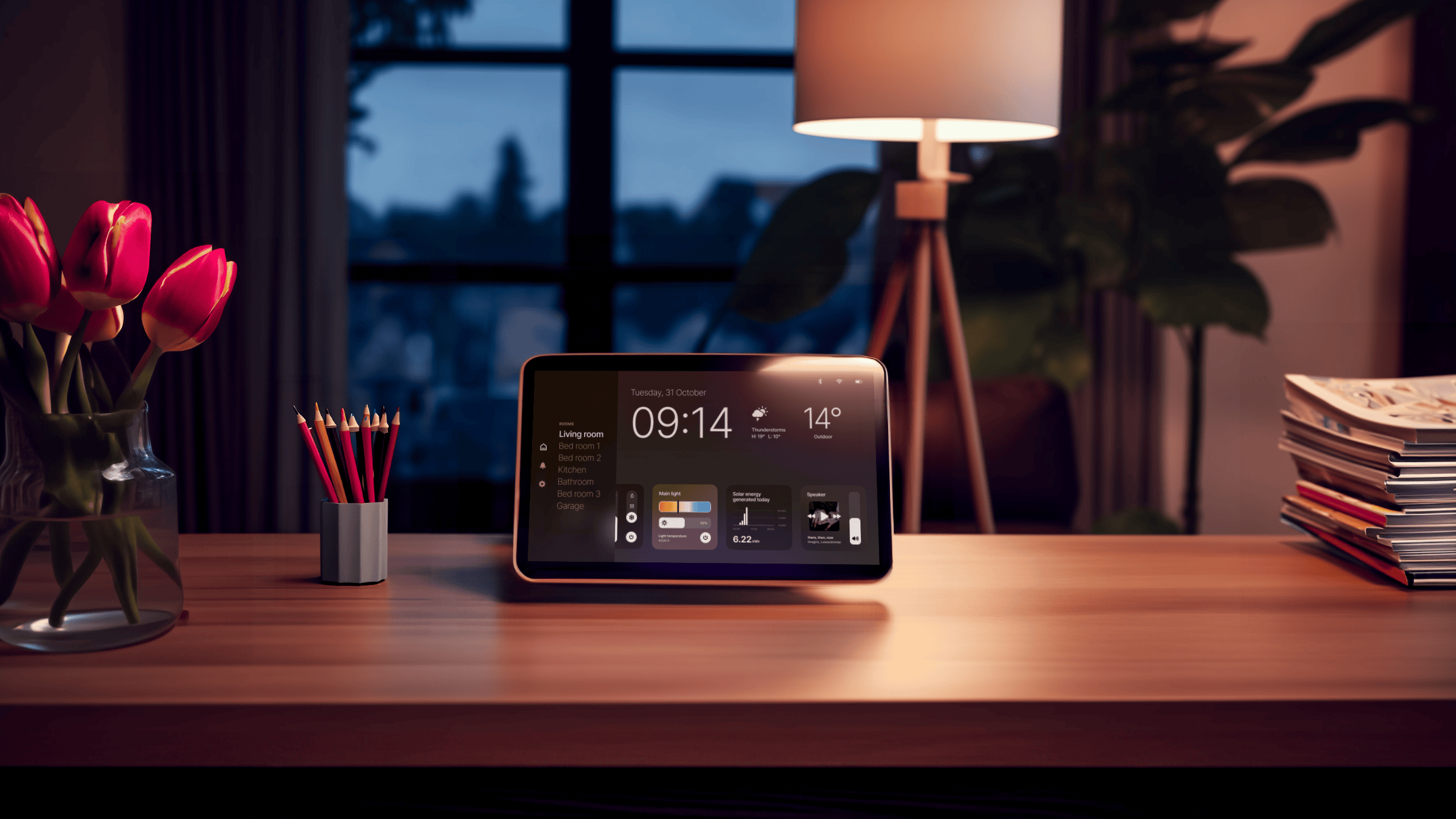
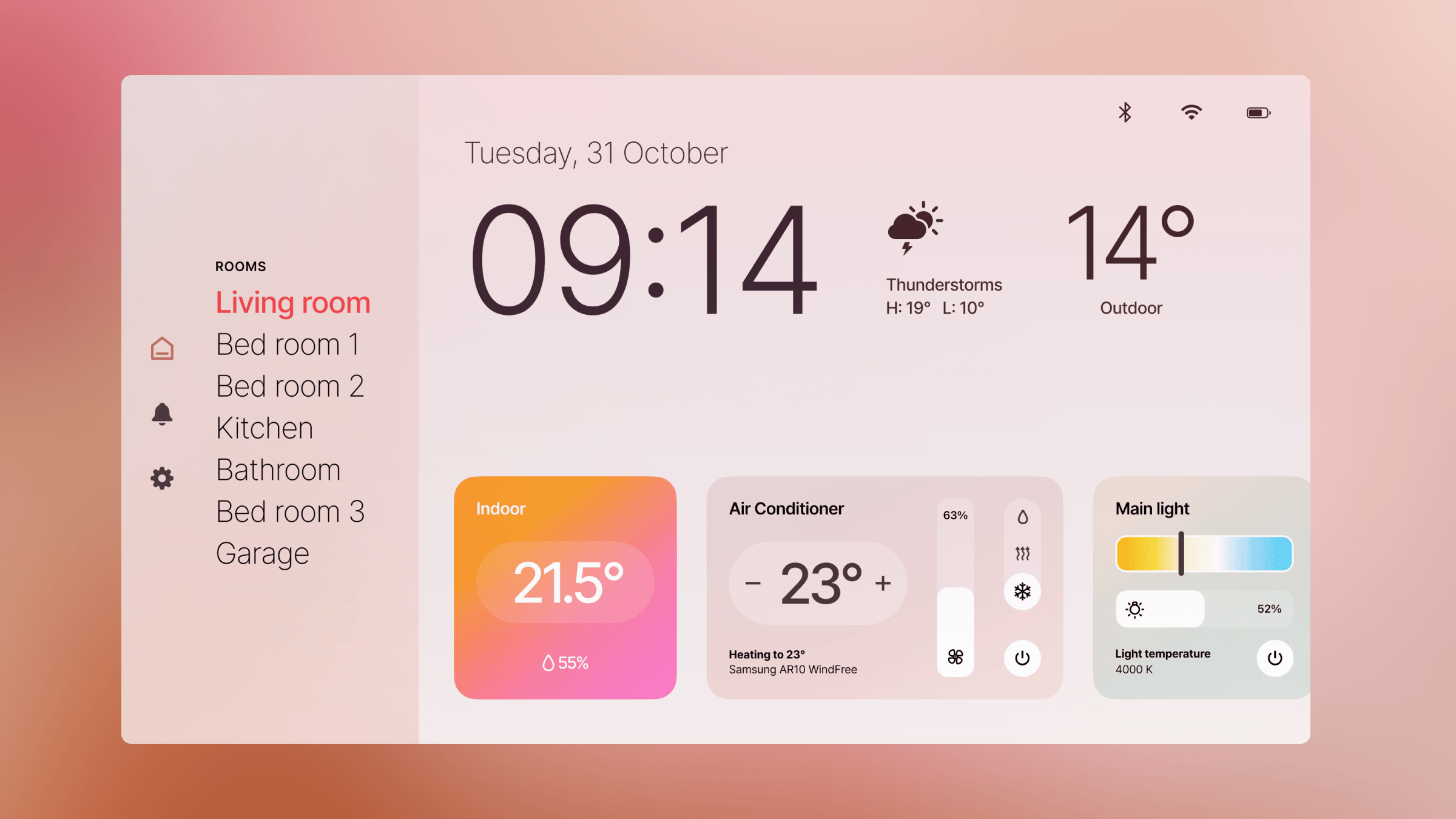
For the first screen, I decided to go with a dark theme, which is often preferred for smart home applications. It provides a sleek and modern look that's easy on the eyes, especially in low-light environments.
Key Components:
- Time and date display
- Icon indicators for wifi, Bluetooth, battery status, and alerts
- Weather information, including external and internal temperatures
- A slider for controlling the indoor thermostat
- A fan speed control slider
- An air conditioner on/off switch
- A settings button
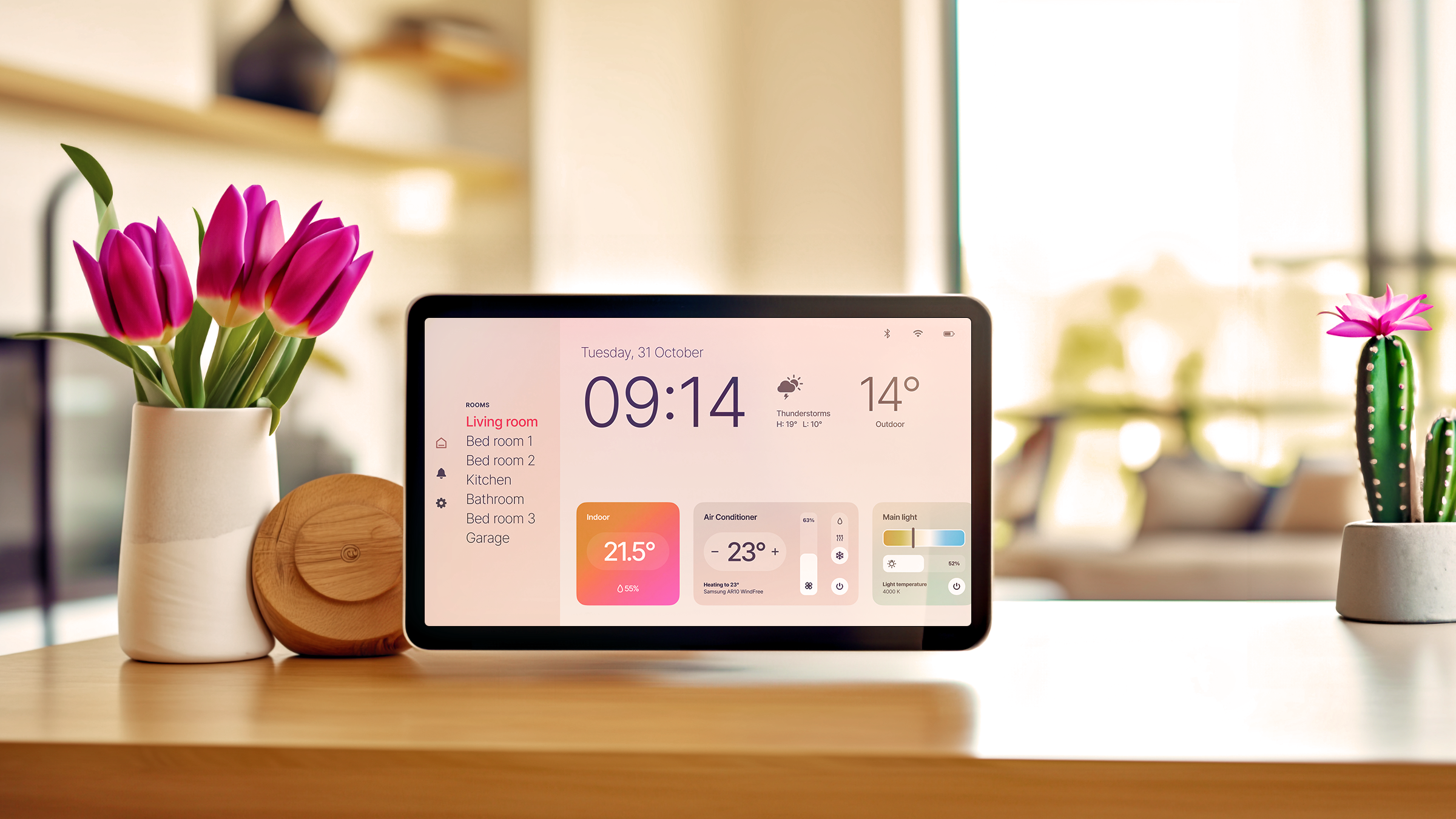
To get started, I used Midjourney to generate an Apple-inspired device set within a dark home interior. This helped create a realistic context for the smart home controller. I chose colors that complemented the base colors of the generated image to ensure a harmonious visual experience.
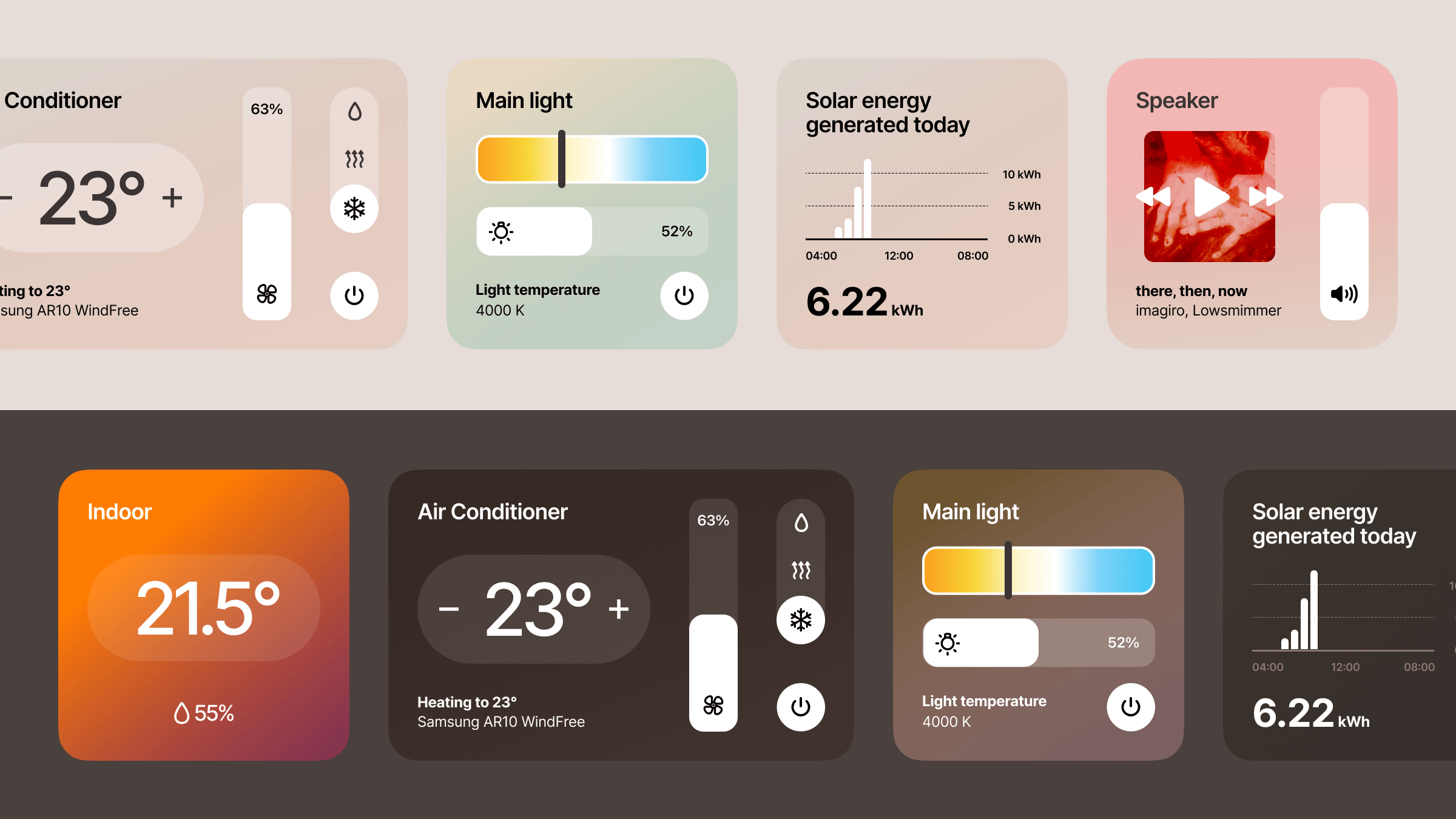
I designed an Apple-like UI interface to present the dark mode user interface and the tile components. This choice was inspired by Apple's clean and intuitive design principles, making it suitable for a user-friendly smart home controller.
Home 2 - Light Theme
Key Components:
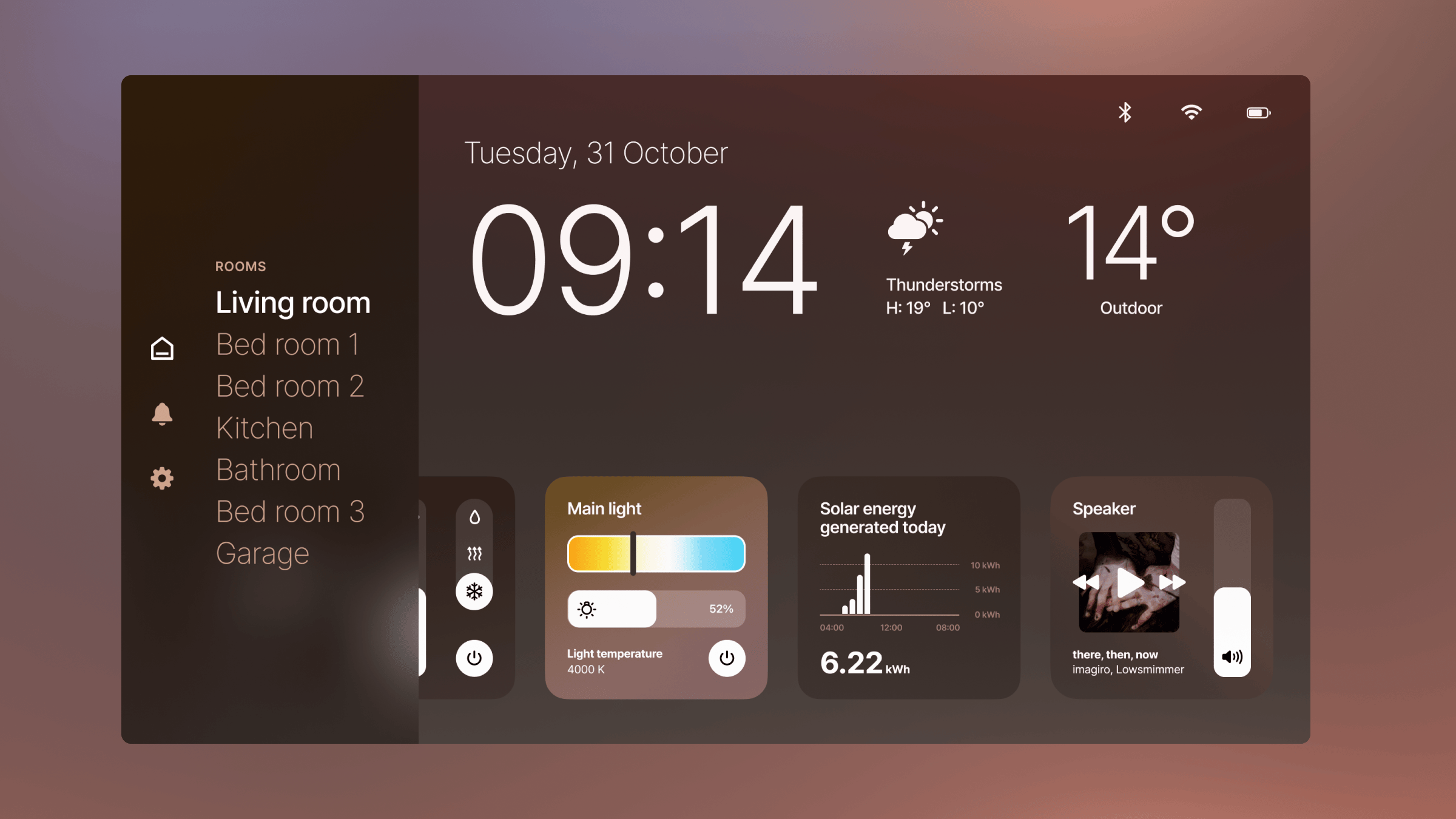
- Time and date display.
- Icon indicators for wifi, Bluetooth, battery status, and alerts.
- A settings button.
- Different cards, with three visible on the screen at once and the fourth partially hidden
- Weather information
- Music player
- Control of rooms and lighting
- Solar panel control and daily production chart
Creating the light theme involved similar steps as the dark theme. I maintained visual consistency in the user interfaces and tile components, ensuring a seamless transition between screens.
In conclusion, this design exercise was an exciting endeavor. Using Midjourney allowed me to create a context-rich environment for the smart home controller, making it relatable and realistic. I paid close attention to colors, iconography, and layout to ensure an attractive and functional design for both dark and light themes.
The result is two distinct user interfaces that cater to different user preferences while maintaining a unified and intuitive experience. The Apple-inspired UI design, with its elegance and simplicity, ensures that users can easily navigate and control their smart home devices.
If you'd like to use these designs for any purpose, don't hesitate to reach out. I'm excited to see these concepts come to life and make a difference in the world of smart home control.
